Contributor
April 13, 2023
Solved

Data labels in report graph

  • April 13, 2023
  • 2 replies
  • 0 views

Hi everyone,

I am creating a graph in a report. This report is a component in a dashboard maintenance unit and is using a simple data adapter linked to a cube view to retrieve the data. 

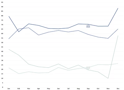
The graph is working. However, I would like to only show a data label based on a time selection parameter that is part of the data adapter. For instance, if I select 2022M11, I only want to see the data label for November 2022. Please see the screenshot for clarification.

FlorisvdPoel_0-1681373550167.png

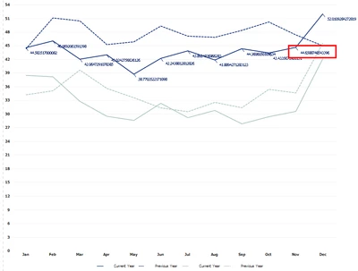
So, if I select November 2022 (or any other year) I would only like to see the data label for November (I still need to work on the number formatting).

Is there anyone with experience in this and can help me? I have checked all the options but couldn't find anything. I was thinking to work with the scripts part of the report components. 

Any help is much appreciated.

Thanks!

Floris van der Poel

Best answer by FlorisvdPoel

Hi Jack, 

I found a solution using a workaround.


FlorisvdPoel_1-1683114964520.png

The data label changes following my time selection. 

I did this by creating two additional data points in the cube view feeding this chart. These data points get the data according to the time selector, and the month from the time selector. 

In the chart, I added two additional series that get their data from the two additional data points. Everything but the data label is hidden. This creates the effect of only showing the data labels for the selected time.

Thanks for your help.

Floris 

2 replies

OneStream Employee
April 16, 2023

I don't have a solution right now, but I can suggest a possible source of information about  advanced features of the Report component. If you go to the Marketplace and select the Platform section, then change the platform version to 7.0, you can download a version of the On-Prem Server & Documentation package that still includes guides for the old Reporting Studio - the direct predecessor of that component. It contains a lot of information that is still valid (and not available anywhere else) for the Report Component.

Contributor
April 16, 2023

Fantastic! I will have a look. Will share if I got something.

Thanks Jack.

Newcomer
April 30, 2025

Hi Floris, 

That's very interesting what you achieved with this graph. On my side I face issues showing up additional labels over my chart (a pie chart) and if I can add my additional data points in my cube view, following what you did on your side, then i don't understand how you were able to place your additional series on top of the initial chart. When I try adding additional series, the graph appear near the first chart, not on top of it... would you have any additional tips here please?

Contributor
May 1, 2025

Hi Florance_Marie,

It would help me if you could share some screenshots. It's now a bit difficult to help you.

Thanks

Floris