Newcomer
March 28, 2022

BI Viewer - Creating a clustered column line chart

  • March 28, 2022
  • 1 reply
  • 0 views

Hey All,

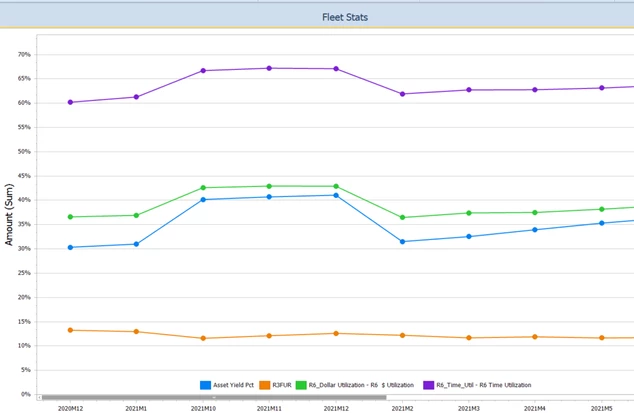
I'm trying to add a column (bar) chart on top of this line chart. But I want it to reference and add a dollar based stats account (e.g. Avg Fleet Total) bar chart. 

I noticed there is a way to add a second axis on the right - so wondering if I can have two charts on the same pane. 

Mustafa_A_0-1648500603245.png


Appreciate the help folks. Thank you!


1 reply

Newcomer
March 29, 2022

Add your Avg Fleet Total measure to the Values pane and choose chart type and in the second tab of the chart type selection window you will have the option to plot it on a secondary axis as in the pic below.

sec_axis.png

Newcomer
March 29, 2022

I did - but how do I select avg fleet acct? I'm using a CV MD data adapter fyi. 

Mustafa_A_0-1648555378602.png


Mustafa_A_1-1648555397079.png


Newcomer
March 29, 2022

Right you should create a calculated field with formula something like this..

Iif(StartsWith([Account]), 'Asset Yield Pct'), [Amount], 0) --Add all your account conditions for you Avg Fleet Acct

Make this Field Type Decimal and add this to your values pane and then choose Average as shown in the pic below

biv_average.png